What is Outdoorsy?
Outdoorsy is a leading peer-to-peer RV rental marketplace that gives RV owners the ability to safely rent out their RVs to potential renters. Outdoorsy differentiates its product offerings from competitors by focusing on user-centric design, trust & safety, and outstanding customer support.
From the beginning
About a year and a half ago I joined Outdoorsy as the first designer initially tasked with updating our flows, updating our visual design, and creating new user-centric mockups. The goal was to create higher converting flows and experiences that were easy to use for a wide variety of audiences. At this time, KPIs were not clearly defined, process didn’t exist, and conversion funnels were loosely tracked on a regular cadence. I quickly had to work to define more clear goals and measurements of success.
I collaborated directly with the development team to gain insights into whatever data was available and learn more about our various flows for all of our various audiences.
The problem
We began focusing on the two major flows within our system. There was the owner flow (list your RV) and the renter flow (booking flow).
Based purely on the numbers that we had gathered from Mixpanel, we found that we had a pretty decent conversion rate for users starting each flow but had significant drop-off rates as a user progressed through the flow.
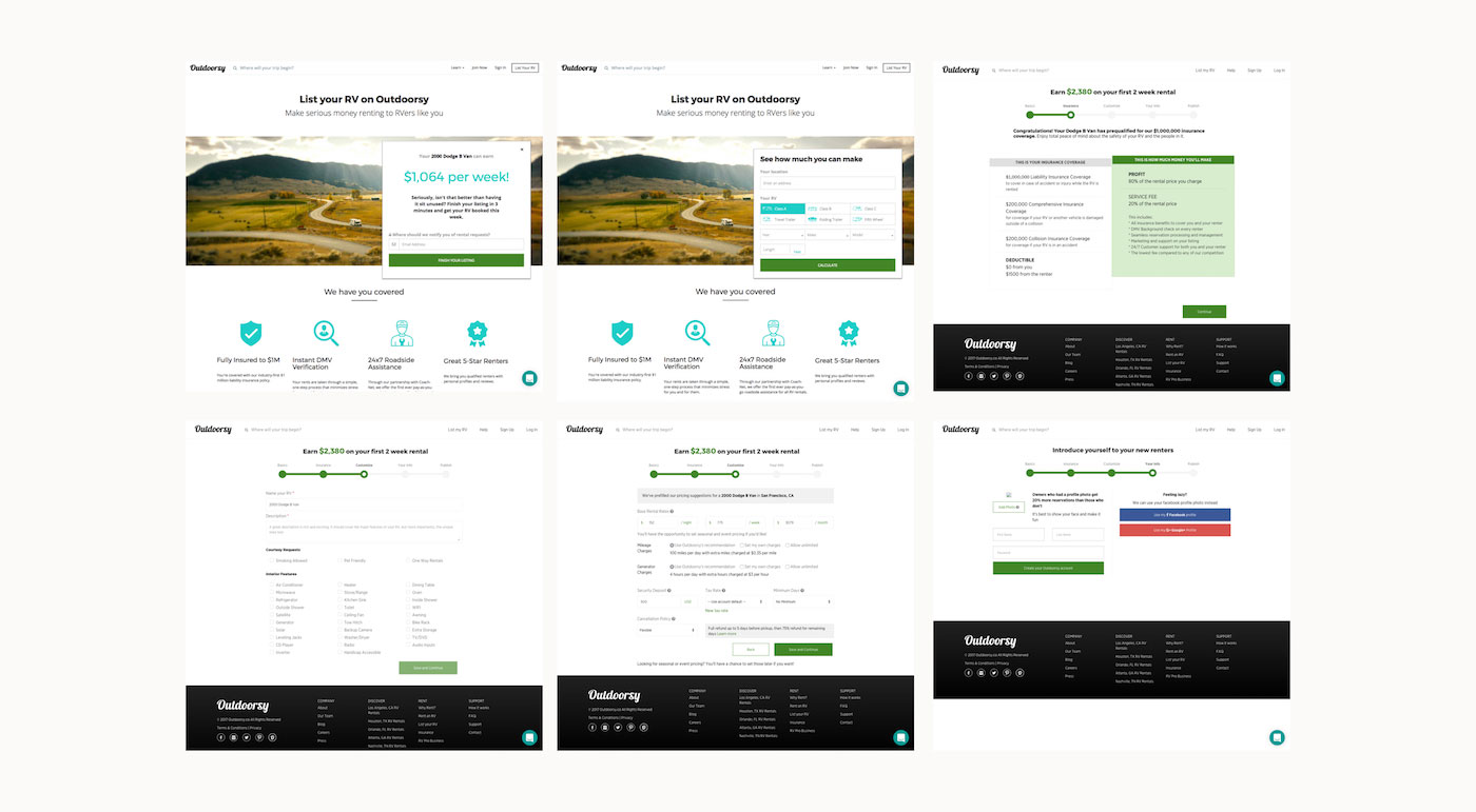
List your RV flow circa pre 2017
Owner List Your RV Flow
- Drop off in the mobile experience
- Unclear UX and error states
- Application messaging and communication on insurance and what to do next was lacking
Renter Booking Flow
- Issues with delayed or no response after sending a booking request
- Unintuitive mobile search and booking experience
Initial user research affirmed assumptions that the mobile experience was lacking due to the fact that mobile designs were never thought through.
During this time, we also utilized data and findings from Inspectlet and Google Analytics to understand the highest priority issue for our users and the company.
During this discovery process, we realized that a large majority of our users were interacting with our product via mobile. We also realized the importance of a mobile-focused approach to design.
We decided we needed to create a mobile experience that allowed both a renter and owner to easily book or list an RV and for better communication.
My role
I began working closely with the iOS developer and our Chief Product Officer to start building a product feature list and roadmap.
After we created an initial product roadmap, I advocated to bring on another designer onto the team to help out with building out some of the flows.
I soon became the lead product designer for the iOS mobile app and collaborated directly with the developer on the project.
The Process
Phase 1: Research & Analysis
I typically begin the process by gathering user data from available sources.
This phase of the process is extremely important to make sure we understand our user’s needs and how that might apply to desired features and experiences. It was important for us to understand who we were solving a problem for and what were the problems we were solving for.

Source 1: Inspectlet Session Recordings
We run Inspectlet on our web platform that tracks user interactions. From there I’m able to see how a user interacts with our product and any potential issues. We have well over 35,000+ recorded sessions, so it was important to filter down to certain key funnels. It was a good starting point to begin forming assumptions.
Source 2: Outdoorsy RV Owner Community Group on Facebook
I also collaborated with our community manager to gather data and set up interviews with Outdoorsy RV owners via our Facebook Owners Group. Our Facebook owners group has over 2,300+ RV owners and users have been very active in this group. It allowed us to gather and create a working list of key issues owners were having with the Outdoorsy platform and start conversations to understand further.
Source 3: Customer Success
I also worked closely with our amazing customer success team who were on the phones and Intercom all day with our customers. We filed UX issues in a spreadsheet and identified potential candidates for an additional user research interview. This was extremely helpful in gaining some baseline assumptions and issues that might need more clarification or perspective.
Source 4: Wheelbase Support & Training
Wheelbase is our pro software available to RV owners that allows them to easily manage their fleet. We have a small team that helps train RV dealers and owners how to use the product. It’s very high touch as all RV dealers get a personal training session. It was helpful to me to be a part of that process and talk to the Wheelbase team to speak with dealers and understand their major pain points.
Source 5: User Interviews
We selected participants from multiple channels and a variety of type of user to conduct user research interviews. We utilized Lookback.io to record all sessions. We chose to use Lookback.io so that we can remotely interview participants from different locations, have face-to-face communication, and record the interactions with the product.
We wanted context around why users were doing the things they were doing. We asked questions like:
- Why are you listing your RV?
- Why are you booking a trip?
- Have you considered other travel plans?
- Tell me about the last time you booked a trip.
- What do you expect to see next?
We wanted to ask and understand why someone is considering an RV in the first place, why they wanted to book or list their RV, and how someone might go about doing so.

Issue Tracking
I managed a small user research team of 2 to create and document all issues identified. We created a spreadsheet to document the source, the problem, and any other things to note to build context around a potential issue.
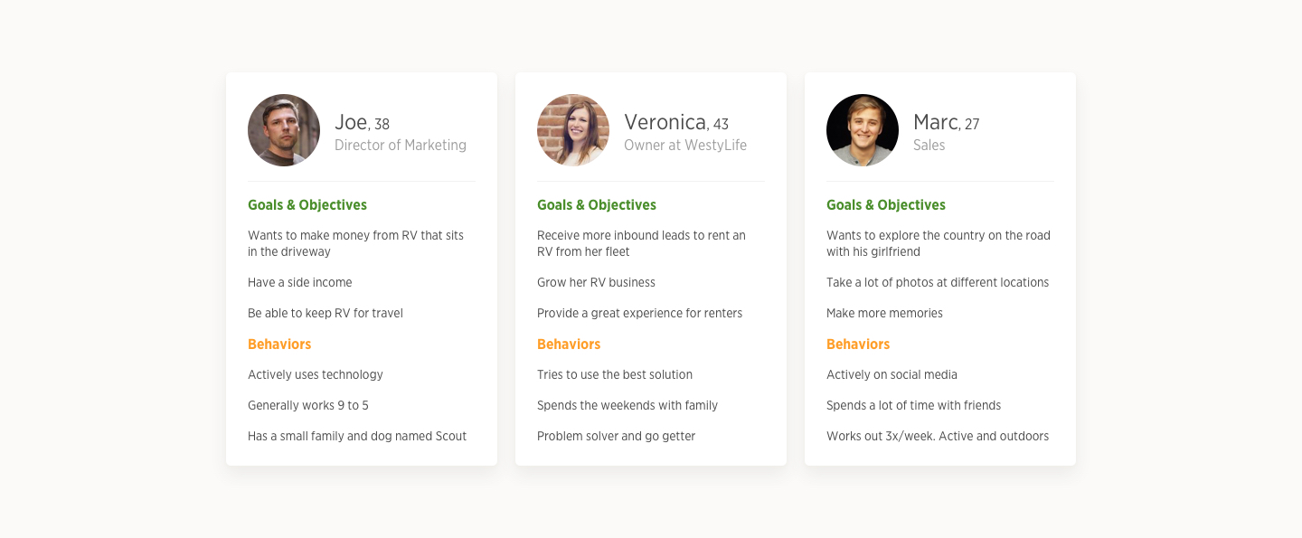
User Personas
There were 3 key sets of users that we wanted to account for: a typical renter, an RV owner, and an RV business owner. Within each category existed a wide range of characteristics.
Creating these personas allowed me to think clearly about how might we serve both our existing users and future users.
Internal Audit & Competitive Research
After spending weeks of getting into the mindset of the user. I gathered screen captures of all parts of the flow and communication points of our web experience to get a basic framework to work from. I also collected all visual examples of everything we’ve created in the past couple of years, including the design system I created a couple months back.
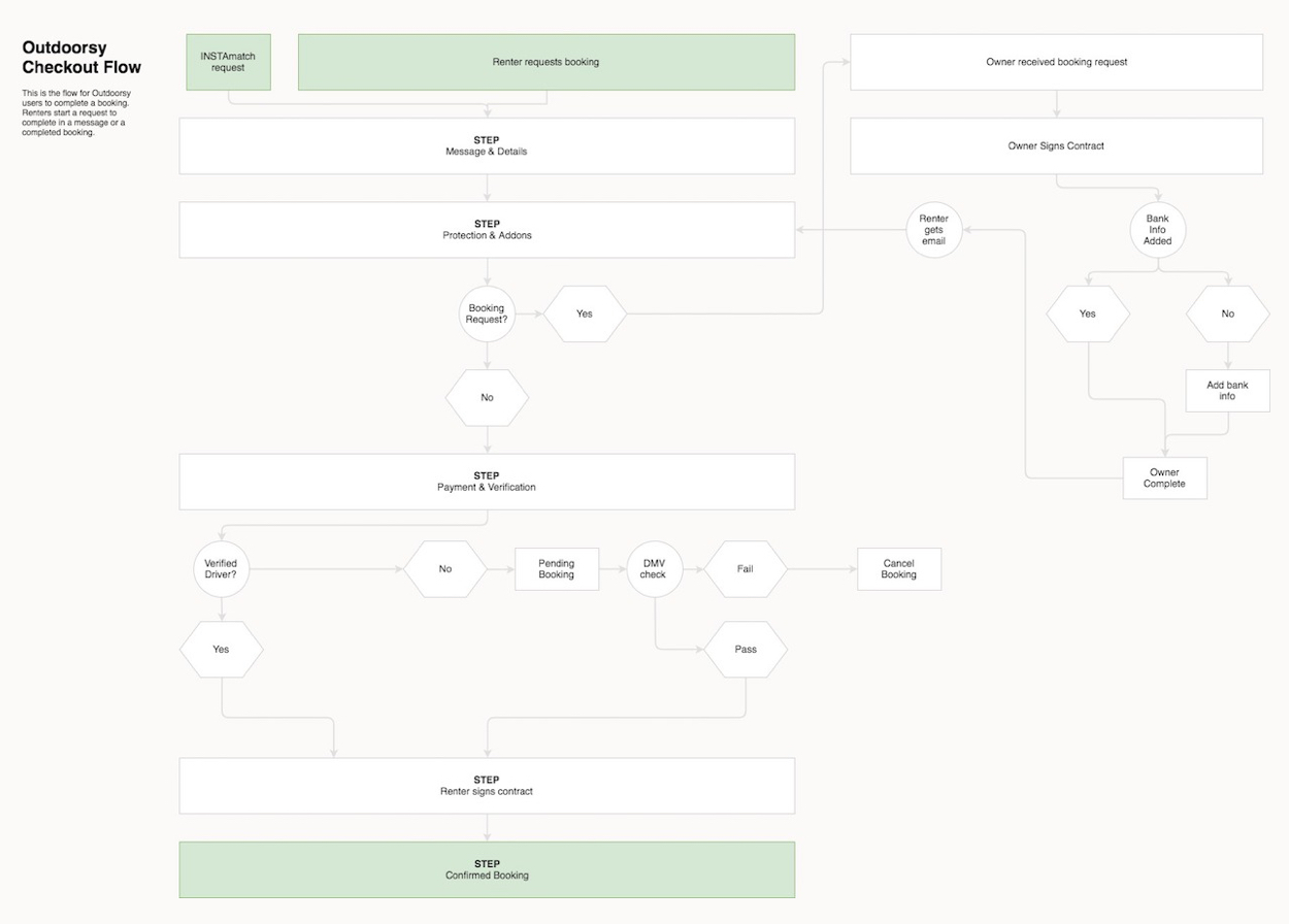
Checkout flow diagram
Phase 2: Strategy and Scope
After I’ve had a chance to understand the marketplace, our user needs, and company objectives, we can move onto the strategy phase. It’s a good sign when initial research and exploration back up early assumptions and informs it with new information and perspectives.
Setting the objective
I met with the Chief Product Officer and two of the co-founders to set an objective for our first launch. First initial talks were high level, but soon became more granular and defined as to how success would be defined.
From a company standpoint, we wanted to ensure 3 key things:
- It must be easy and simple for a renter to search, find and book an RV.
- It must be easy for an RV owner to list their RV.
- The app must allow for easier and faster communication between parties.
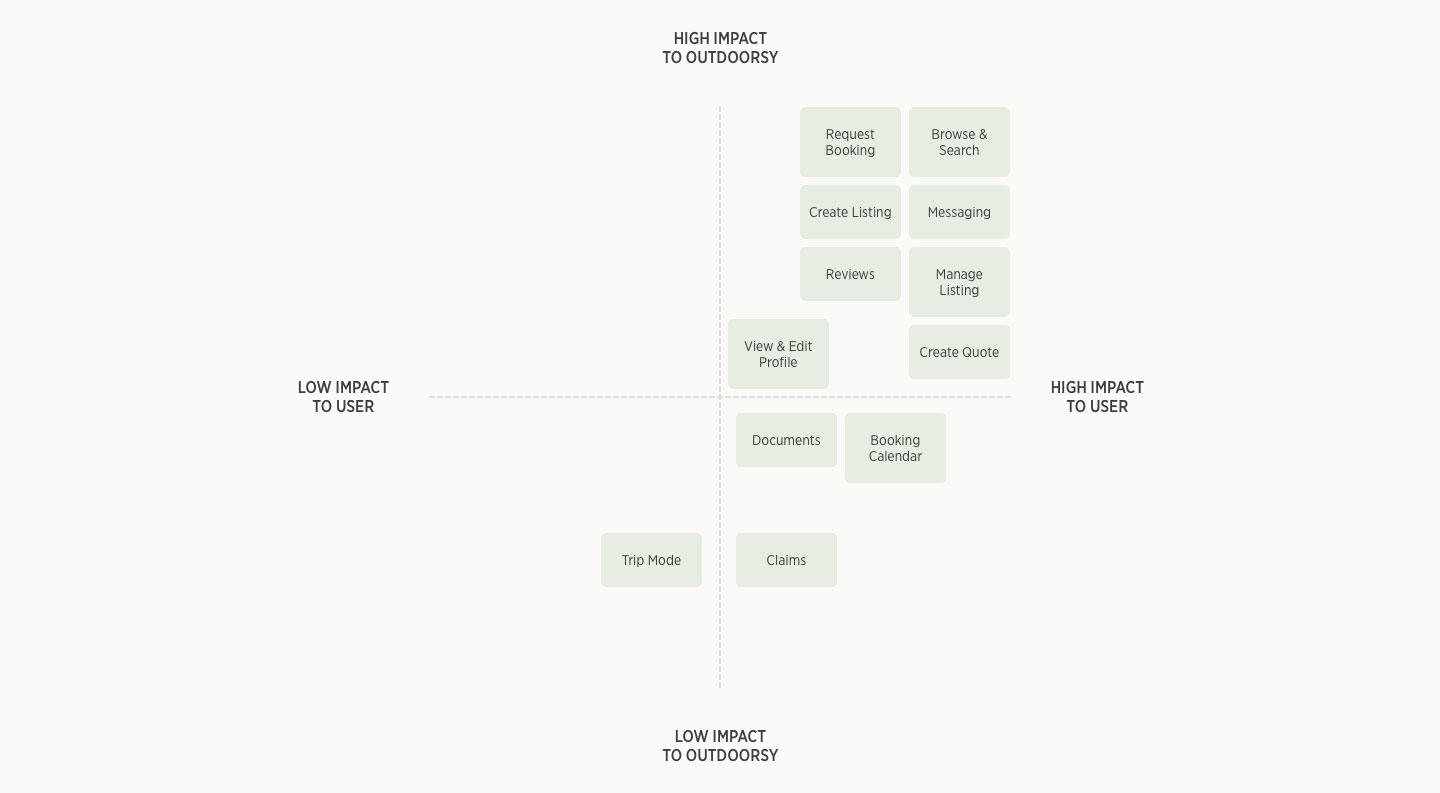
Feature scoping and impact
We then needed to determine what features were important for our users. To help with this, I utilized a 2×2 matrix to visualize patterns and determine high impact features to both the user and for Outdoorsy.
Creating the roadmap
After determining the feature set for the application, I worked with the team to set an initial roadmap. Since the product was being built from scratch, it was important to make sure the bare essentials made it into the first pass. With each new release, we wanted to incorporate more benefits to each side of the market so that one side was not forgotten.
- Phase 1 — Essential functionality. Allow a renter to search, find a book and RV. Allow an owner to List an RV. Allow both parties to communicate.
- Phase 2 — Management & Reviews. Allow the owner to easily manage all aspects of their rental. Allow both renter and owner to leave a review.
- Phase 3 — Stories & Claims. Allow an owner to easily file a claim. Allow a renter to share memories from their trip.
- Phase 4 — On-going.
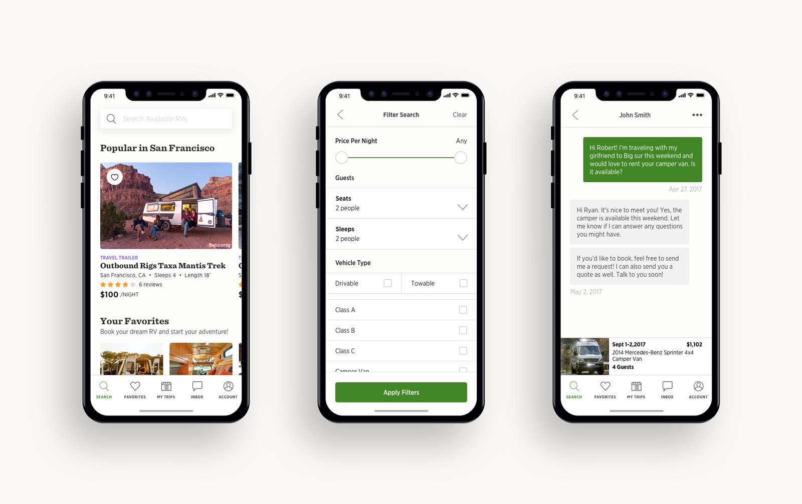
Phase 3: Mockups & Exploration
We knew what our users wanted, we knew what we wanted, and we had our roadmap. Now it was time to start exploring concepts and flows.
A lot of time was spent around adjusting our current design system to account for native iOS.
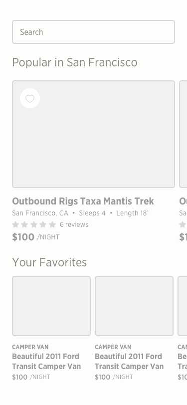
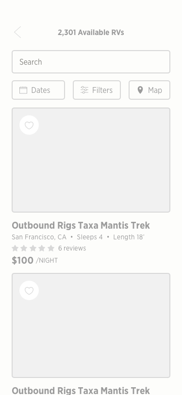
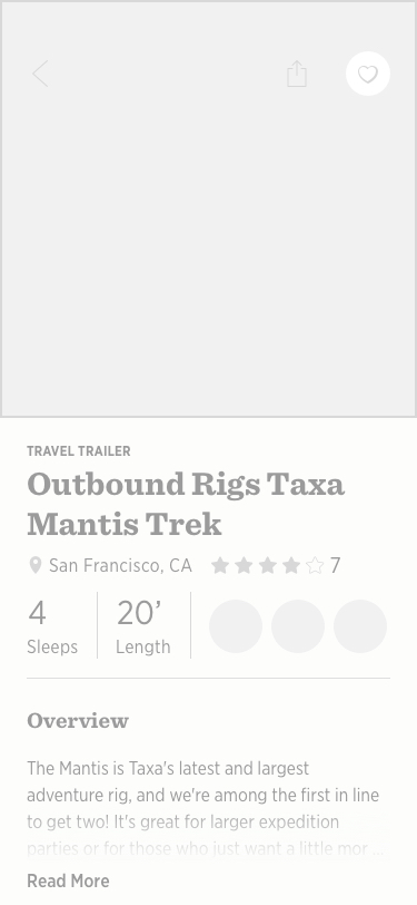
Taking a look at our card design, we wanted to push the boundaries by making cards fuller width.
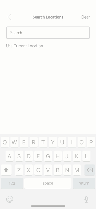
We also wanted to make sure inputs were larger and placement made sense for a mobile device.
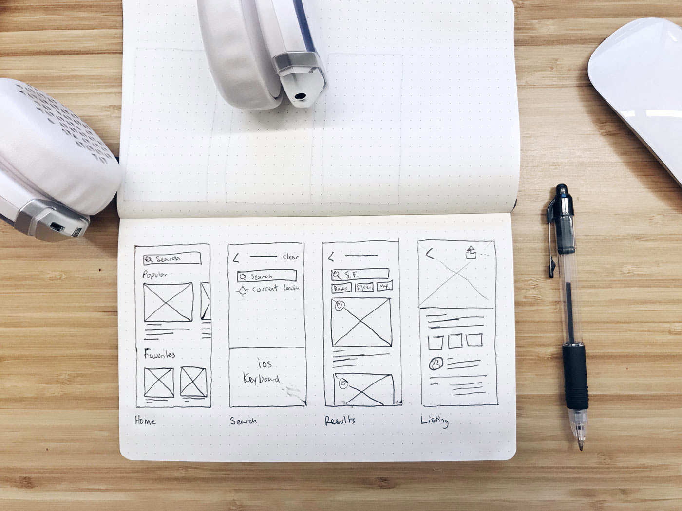
The iOS developer and I went back and forth on best practices and any missing parts. During this phase, I spent weeks building out various states, flows, and edge case wireframes to make sure we thought of the entire user journey.
Phase 4: Design
I spent weeks applying our design system to use. I collaborated with another designer to make slight adjustments to interface elements to adhere to Apple’s Human Interface Guidelines. I experimented with various input types, expanding our card design to fuller width, experimented with depth vs flat, minimalism, and simplicity.
I wanted to keep in mind an interface that would be clear, concise and easy to use for a wide age range and demographics.